I am currently really enjoying playing with paint and seeing what effects I can create. More than that I am enjoying experimenting with 'not being perfect' - you know that urge we have for everything to be lined up perfectly! This page was formed out of just such experiments - it was created without the the use of a paintbrush!
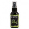
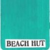
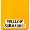
Using Lime Dylusions spray I sprayed the whole of the background and then added a very thin layer of white paint with my palette knife (your paint will go a sort of sage-y colour). Then I added a thin layer of Beach Hut which made the page come alive. I added a border of yellow with my finger (yes, finger painting!) which became a frame. I then added a little green paint to act as a highlight. The green ties in the blue and yellow and anchors the frame in the page. With a charcoal pencil I drew round the frame (no need to be terribly accurate here!) and then smudged the pencil lines. I added a few stamped lines at the corners of the frame.
The chaps (Tim Holtz stamps) were stamped onto tissue paper and then painted on the reverse. While they were drying I stamped the words and then emphasised them with white pen. When dry I adhered the chaps to the page with Multi Matte Medium. This page would work well for the current challenge of 'Only Men Allowed' at our challenge site. Did you spot the differences? There's a sneaky difference that's really hard to spot... there *might* be a clue in the products below!




hmmm sneaky indeed but I'm guessing one of the chaps wasn't stamped in black.. ? Gorgeous, Gabrielle, love the background. Must try "painting" with a palette knife....
ReplyDeleteFabulous, love these guys!
ReplyDeleteThis is really kewl Gabrielle, and so, so clever when you've used a knife and fingers. I haven't made out the difference yet but I'm working on it. >;o) Chris xxx
ReplyDeleteVery cool - love those colours! I'm thinking Helen's spotted it...
ReplyDeleteAlison x
Thank you for your lovely comments! The brown ink is on the frame so the difference is still to be found! It's very subtle!!!
ReplyDeleteWhat a great idea, looks fabulous. The only thing I can see possibly is the blue jacket man has some green highlights to his wings. X
ReplyDelete