
Hi Brenda here.
Here's a quick background for you and using the Tim Holtz doily stencil with infusions but do read on to the bottom as you will see what happened after I had created and photographed the process steps.
When using a stencil and Infusions (or other watercolour powders) you can get both a positive and a negative design from them. let's take a look.
1. Lay the stencil on the card, spritz lightly with water and shake some infusions powders lightly over the top. I used Royal Blood and Sunset Beach. Spritz over the surface again lightly with the water mister ........

2....... so that the colours will settle onto the card and you will also have watery colours on the surface of the stencil.

3. Remove the stencil and you will be left with the positive design, roll a paper towel over the surface to remove excess colour or heat dry.

4. Take the stencil, flip it over and lay on a piece of card, press down gently with a piece of kitchen roll.

5. When you remove the stencil you are left with the negative design - my one is rather watery so ease up a little on the spritzing if necessary.


1. Lay the stencil on the card, spritz lightly with water and shake some infusions powders lightly over the top. I used Royal Blood and Sunset Beach. Spritz over the surface again lightly with the water mister ........
2....... so that the colours will settle onto the card and you will also have watery colours on the surface of the stencil.
3. Remove the stencil and you will be left with the positive design, roll a paper towel over the surface to remove excess colour or heat dry.
4. Take the stencil, flip it over and lay on a piece of card, press down gently with a piece of kitchen roll.
5. When you remove the stencil you are left with the negative design - my one is rather watery so ease up a little on the spritzing if necessary.
6. Again roll over the surface with kitchen towel or just heat dry.
7. Lay the stencil back over the design, take a couple of distress inks and blend them over .....

8...... so that you fill in the positive image again.

Ok so this is where I say my stencil choice and colour choices did not go well together and to be honest I think it will have to go in the bin - see we all do it lol. I debated starting from scratch and re-doing everything again but I think it's important that we share our mistake as well as our successes, we can't get it right every time. So here's another I made and used for the final card.
Here I used the Nordic stencil with Violet Storm and A Bit of Jade Infusions ......

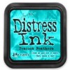
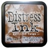
...... and dusty concord, peacock feathers and gathered twigs distress inks for a completely different look.

8...... so that you fill in the positive image again.
Ok so this is where I say my stencil choice and colour choices did not go well together and to be honest I think it will have to go in the bin - see we all do it lol. I debated starting from scratch and re-doing everything again but I think it's important that we share our mistake as well as our successes, we can't get it right every time. So here's another I made and used for the final card.
Here I used the Nordic stencil with Violet Storm and A Bit of Jade Infusions ......
...... and dusty concord, peacock feathers and gathered twigs distress inks for a completely different look.
I cut the design to 9½ x 18 cms and a tall card to 10½ x 19 cms so they would fit together.
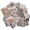
gathered some elements to make up a collage and sentiment.

And hey presto we have a vintage card.

Thanks for bearing with me, I hope you get to have a play with the infusions and if you's like to see more I have another design over on my blog too. I would love to see you over at Bumblebees and Butterflies.
Happy Sunday.
hugs Brenda xxx
gathered some elements to make up a collage and sentiment.
And hey presto we have a vintage card.
Thanks for bearing with me, I hope you get to have a play with the infusions and if you's like to see more I have another design over on my blog too. I would love to see you over at Bumblebees and Butterflies.
Happy Sunday.
hugs Brenda xxx


Great step out Brenda and I have to say I actually like both colour choices.... I think the first one would make a superb autumnal piece.Hope you'll keep it, not bin it. Like always, the collage elements look great and make for a wonderful vintage card!
ReplyDeleteoo must try that.
ReplyDeleteThanks for sharing this Brenda. It comes as something of a relief that you might actually need to bin something! If I were to post all my rejects well then I'd have no time left at all! Your 2nd edition is beautiful! Nicola x
ReplyDeleteOh I love how you filled in the positive image, such a great idea and the result is so beautiful! Your finished tag is fantastic! Anne xx
ReplyDeleteI actually love both backgrounds, and I would keep the first for another project! But the second is lovely with the colors you chose! Your finished card is just beautiful with those collaged bits! Would love to spend a day or a week crafting with you so I could absorb just a bit of that fabulous talent! I'm so going to give this a try!Thank you for sharing your steps. Hugs!
ReplyDeleteI like the technique! And the finished tag is awesome!
ReplyDelete