Showing posts with label Acrylic paint. Show all posts

Wednesday, 1 April 2020

Chapter 2 Tim Holtz dies

Hi Brenda here with two Spring cards using two of the new Tim Holtz dies.


For the process steps and photos showing how I made these cards please pop across to 
Bumblebees and Butterflies where there all the details can be found including a new way to use acrylic paints for the background of the first card.

hugs Brenda xxx


Friday, 17 May 2019

Blended background using acrylic paints

I love my DecoArt Media Fluid Acrylic paints and I have blended them for this journal panel using blending tool and foam.


I took quinacridone violet, cobalt teal hue and transparent yellow oxide which are all DecoArt Media transparent colours and translucent white which is semi transparent and blended them over a textured gesso background blending with a blending tool and blending foam and rubbing back with dry kitchen paper. When I was happy with the pale colours I then sanded lightly over the surface to reveal some of the white of the gesso below. Using ground espresso distress ink I blended around the edges of the card to give it a more vintage appeal and rubbed a little in the centre too wiping it back with a damp cloth.


These gorgeous transparent butterflies are from Tim Holtz. They are shiny and because I wanted it matte I painted a coat of DecoArt matte medium over it which dulled it down beautifully. I love how the background and particularly the text shows through.


I die-cut some wildflowers and used one of the photobooth vintage photos in my collage along with some bits and pieces I collect to use for putting my collages together. I also love adding natural elements to them.


The quoteid from one of Tim's sets of stamps called 'Nature's Wonder'.
I shall now add this to my 'Nature' journal I am slowly filling up.


hugs Brenda xxx


Available from the shop


Monday, 21 January 2019

Sweet Cottontail mixed media card

Hi it's Brenda and I'm with you today to share a card with some of the new Tim Holtz products coming out for Creativation. The dies are sizzix chapter 1, the first release for 2019, there will be three more to come over the year

I loved this cottontail as soon as I saw him and will be using him for a workshop coming up soon.


Process steps
Dip and dry the die-cut cottontail in a watery wash of burnt umber and dry.
Repeat with burnt sienna, then raw sienna finishing with raw umber.
Darken the edges with ground espresso distress ink.
Cut another cottontail and paint him black and copper.
I just love the shape of this cottontail and there's a bow to go with him too.


Take a piece of worn wallpaper and give it a watery wash of white gesso and dry. Repeat if necessary.
Stencil with a mix of cerulean blue mixed with titanium white and another stencil with  sap green and titanium white.


Brayer a couple of layers of titan buff over the whole background ....


and then dip and dry in the light blue, light green washes with a tiny drop of raw umber in them to vintage them. When dry splatter with some titanium white and  burnt sienna finishing with a tiny amount of monoprinting with watercolour paper using titanium white and titan buff mixed together.


Cut some of the lovely new Tim Wildflowers Stems from media paper and paint/watercolour using fluid acrylics and a water spray.


Make a greetings embellishment and dye some cheesecloth using watery raw umber and titan buff.


Assemble the card.
The Beauty is in the Details

Once I had put the main pieces together I then played with some flat backed glass domes and a mirror star. With some white gesso, raw umber paint. metallic lustres and mate medium I altered them to look like these.


I also used Tim's new 'bone' mixed media powder to die. cut the bow. I sanded the edges and blended in ground espresso distress ink.


Yep I'm really happy with that now.


Thanks for popping by, I hope you like this fun card and if you have a go at using my process steps please leave a comment below with a link back to your post.

Have a great week.
hugs Brenda xxx


Supplies
Dies - Sizzix Bigz - Tim Holtz - Cottontail. Sizzix Thinlets - Tim Holtz -  Wildflower Stems #1, Sizzix Thinlets - Tim Holtz -  Garden Greens
DecoArt Media Acrylic paint - burnt umber, burnt sienna, raw sienna, raw umber, cerulean blue, sap green, titanium white, titan buff, carbon black, pyrrole red
DecoArt Media Mediums - white gesso
DecoArt Dazzling Metallics - copper
DecoArt Metallic Lustres - white frost, cosmic blue and iced espresso.
Tim Holtz Worn Wallpaper
Stencils Tim Holtz
Mixed Media Powder - Bone - Tim Holtz
Flat backed glass domes and mirrored star

Monday, 30 July 2018

Entomology board and simple background for mounting on.

I got the bug for this set of stamps - please excuse the pun lol, but the little creatures called to me to use them in a project so here is an easel board and yes my faux encaustic technique again.


Cut a piece of thin greyboard and adhere a piece of designer paper - mine is from the Tim Holtz Correspondence set - using the decoupage glue and seal the top with it too. When dry mix watery media fluid acrylics in three colours and dip, drip and dry random pools of colour and heat dry between each layer so the colours don't mix and produce mud.


Next mix some watery gesso and repeat the technique again.


Stamp three of the bugs - I used Tim's stamp platform and so glad I did as I was able to give it a second stamping to get very clear and sharp images.


I used the same colour paints I had in front of me to mix blends to paint the bugs and I adhered a plate name for each of them. (See my freebies page located just under the blog header to download for you to use).


I applied a thin coat of DecoArt clear modeling paste and left it overnight to dry.


I took some white gesso and transparent yellow iron oxide media fluid acrylic and blended them together to get a very light yellow colour and with blending foam I stenciled using one of Tim's mini stencils. This began to create some depth and interest. I also added a little text stamping using the gorgeous text from the Etymology set.
I also made a watery wash with raw umber fluid acrylic and dribbled and dried some round the sides and I distressed the edges and painted them with the left overs.I splattered a white gesso/raw umber mix covering the insects to begin with so they got barely any on them. I got so involved in the process I forgot to take a photo here.
I finished with a thicker layer of the clear modeling paste.


You can see how the layers are creating some depth.


To help bring the bugs nearer to the surface again and be more prominent I drew round them and added a little of the detail with a permanent black pen and added some asemic writing in white a also a white remnant rub. To encapsulate it all and seal it I gave it another thin layer of the clear modeling paste.


To create the simple background on the canvas board I simply took phthalo green blue, transparent yellow iron oxide, titan buff, titanium white and burnt umber and blended over with a baby wipe. As areas dried off I kept adding more colour and rubbing some away with the babywipe until I had a mottled effect.


Next with a small brayer I rolled on a little of the titanium white around the edges (remember the panel will sit over the centre). You could also add some very light text stamping if you wished, but I didn't want to detract from the central panel being the main focal point.


Create a 'dirty' wash (I use different colours according to how I want it to look) I used burnt umber, raw umber and titan buff to keep it light in colour - I didn't want a really dark one. I also just finger painted and added some darker areas on a few of the edges. If the brown comes out too dark you can always rub it back with a wet wipe even after it has dried for a while.


Finish by adding an easel to the back .....


... and you're ready to send it to someone special either as a gift or add a sentiment as a special easel card.


Thanks for stopping by.

hugs Brenda

www.bumblebeesandbutterflies.com


Monday, 28 May 2018

Working with the new 3D folders by Tim Holtz (2)

If you saw my post on Friday (scroll down to find it) you will have seen how I used one of the 3-D Texture Fades to make a background for two pretty shabby vintage cards, today I am using the Foundry EF to make this industrial tag. Again check out the previous post for the link to Tim's video where he shares lots of tips, tricks and ideas for using them.


I began by sticking some metal tape to black card and running it through the Big Shot. The details that emerge are so textured and clear, it really looks as though you have sat ans tuck individual pieces over a silver background to create this design.


FRom the back you can see the debossed side and how the details are imprinted into the card.


I adhered the card onto a chipboard tag and left it for the glue to dry .......


.... before rubbing in some carbon black and burnt umber premium acrylic paints from DecoArt. I left it to dry for a couple of minutes and then added a small amount of the black paint again and rubbed it over with a dry babywipe - you could easily use a soft cloth. You can see this left some of the paints in crevices and now is beginning to look aged and timeworn.


When this was perfectly dry I rubbed over some quinacridone gold media fluid acrylic and again left it to dry and repeated the process above.


Lastly again when it was perfectly dry I painted some raw umber, paynes grey and quin gold into crevices, spritzed them and let them move around before using the heat tool to dry them.

It's now ready to add some rusty looking cogs, gears, some remnant rubs and a vintage photo.


Have fun with the 3-D texture fades and this technique.


hugs Brenda xxx


Wednesday, 21 March 2018

Find the beauty ......

I have a little journal panel to share with you today made entirely with DecoArt paints and mediums and some of the brand new Aall & Create stamps.


The background was made by laying down some gesso applied on the back of a palette knife and left to dry before adding in some colours - primary cyan, cerulean blue, titan buff, raw umber and burnt umber, taking time to add some dips of watery washes of these colours and finishing with a brayer and titanium white to bring some brightness back. 


The stamp set has 11 stamps in it, so there's plenty to help make up a composition with the brush which has written around it -
Art washes away from the soul the dust of everyday life.
The stamp above says - Creativity takes courage.


The little arrow and dots make a nice fill in piece and the circles make up a great border.


I love using text so I added some very light random stampings of one of my own small stamps.


I used the quotestamp on paper so that it stood out more and shaded round it after I had finished and sealed it all with matte medium.


To get the finished look I splattered some raw umber and white paint and dried it and took my white posca pen to add some small dots in the circles and a black one to add some squiggly border additions. I sanded the edges and blended in ground espresso distress ink.


Thanks for stopping by.

hugs Brenda xxx


Monday, 28 August 2017

Emboss resist journal panel

Hi  - it's Brenda with you again today and I am finishing the month continuing the blues and greens challenge theme with another technique and journal panel.


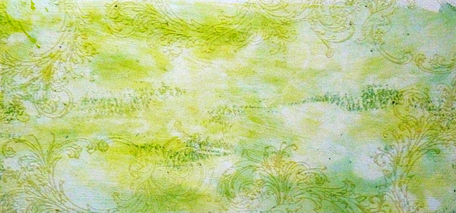
Paint a coat of white gesso over a piece of card then paint a watery wash of green gold and dab most of it off with a piece of kitchen towel, then repeat with a watery wash of phthalo blue.
Stamp and clear emboss with a patterned stamp.


Dip, drip and dry watery layers of blue and green acrylic paints. (I mixed my own using prussian blue hue, phthalo blue, titanium white and diarylide yellow). Try not to melt the embossing but at the same time just as it's cooling rub with a babywipe and kitchen roll over the raised shiny areas to wipe any paint from the design and keep it showing through. Note - do not rub too hard unless it's cooled right off.


Dabble over some white watery paint to knock it back a little and add more colour dipped or dabbles if needed....


Randomly splatter some white and blue watery washes to create some depth of colours and add a little light text stamping in cornflower blue archival.......


..... and because I like to vintage and mute the brighter colours in my palette I added a tinted glaze made up of ultra matte varnish and paynes grey paint.


I hope you have enjoyed the challenge theme this month. If you'd like to see how I finished off this background then pease pop over to Bumblebees and Butterflies for more details.

Thanks for stopping by.

hugs Brenda xxx