Showing posts with label vintage. Show all posts

Monday, 11 March 2019

Vintage journal pages and new Alison Bomber stamps

Hi it's Brenda here today and I'm sharing some vintage journal pages created so that I could specifically use the fabulous new stamps from Alison Bomber. I love using quotes on journal pages and Alison has quite a few sets of different themes - the ones I chose are the new 'Friendship' set - EAB10 from PaperArtsy.


The quotes are varied and beautiful. These were stamped onto media paper and chopped up; I inked the edges with ground espresso distress ink before adhering them to the page.


I started with a layer of white gesso covering the page before adding some collage papers. I then added scrapes of black gesso and more white gesso.


Some subtle stamping creates a little more interest as does some small die-cuts and a couple of tickets.


I finished off with the paper dolls with some cheesecloth and of course the important words that give the pages meaning and a story.


There are some more photos of the process steps over at Bumblebees and Butterflies if you'd like to have a go at something similar.

I'll be back next week to show you photos and the project from my workshop last Saturday held at the Country View headquarters.

Happy crafting.

hugs Brenda xxx

Monday, 10 December 2018

Vintage Santa cards - Brenda

Hi it's Brenda with you today and I have been using the fabulous Yuletide stamps by Tim Holtz which are available in the shop.

I made a set of 7 cards in different colours and I'm sharing the green ones with you today. The original set which are blue can be found over at Bumblebees and Butterflies here and I will be posting a pink and grey set on my blog as well on Wednesday.


These don't take too long to make and I'v kept them flat so they can easily be posted.

Thanks for stopping by.

hugs Brenda xxx

Friday, 4 August 2017

Mixing the old with the new

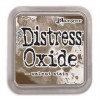
Hello it's Jane from Jane's Journal here today sharing some of my newest Tim Holtz buys. I am super excited that in September I will be attending his workshop and will be  playing more with his Distress oxides but for my post today I wanted to share a vintage tag I made using his Distress Oxides and the fab paper dolls , mixing them with some of my older products in my stash, particularly Tim's layering stencils .


If you would like to see the inspiration for my tag today I have linked my own blog post up here sharing a day in London seeing the "old" and the "new" in my favourite city in the world. You will see lots of photos of a sunny day out. I make "Moments" for my physical Jane's Journal to remember special occasions in my life. Sometimes I make art journal moments, sometimes I make tags. It was our wedding anniversary and we celebrated over lunch in the Fenchurch restaurant of the Walkie Talkie building. For this "Moment" I decided to make a tag.

I have provided links to the shop in my post and if any of the products I am sharing are out of stock do fill in the email request and Susan will email you as soon as they are back in stock.
I took a size 8 tag (I cut my own with the Framelits set here ) and made a background using the wrinkle free technique and 3 oxides; fired brick spiced marmalade and broken china and as these were the predominant colours I saw on our sunny day out. I kept the blue at the top to represent the blue sky we looked out to from our table.


I stencilled in some sunny rays using the rays stencil and fossalized amber oxide to represent the sunshine streaming in that day.


I used some of Tim's older stamps to stamp a random love letter background using sepia archival ink.  This is to celebrate our anniversary and 36 years of love and fun...yes I married my soul mate and I know I am very lucky.

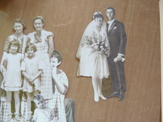
 I also wanted to use one of the great paper dolls. As I looked through the pack I found a vintage bride and groom and I thought it was perfect for my old and new tag

I  die cut an old Sizzix house, bought from the year round CVC sale page (you can find lots of bargains here all year, there are lots of Tim products there too)  a while back and snipped off the bits I didn't need and used some snippets of paper from my stash and a piece of tissue tape to anchor everything together as a mini collage.

I also used the mini heart stencil from set 6 and added some more fired brick oxide to leave "lots of love" on the brides dress and at points on the tag.

 I also added some remnant rubs from the life quotes  set. I thought this saying was perfect.

I finished off with some words from the Ideaology small talk pad and a little red heart from my stash.

Here is my finished tag.
and a few close ups. I love using the Oxides through stencils, they layer up perfectly. 


I really am enjoying playing with the oxides and mixing the old with the new.

A little heads up...Susan is expecting the new colours of Distress Oxides in very soon...I have some on pre-order and cannot wait to play with those too.  Remember that for the UK your orders are also  posted free. These inks really are a game changer in my books, I love crafting with them.

Thanks for stopping by,

Bye for now,

Jane x

Monday, 12 June 2017

Scrapcosy radishes

Hi It's Brenda with you again today and I'm sharing a card made with those gorgeous images from Scrapcosy at PaperArtsy and her vegetable set. 


You may remember my cabbage one I made a little while ago and this is the radish design which I love. Here is the whole set.


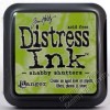
I began by stamping the radishes on card using four different archival inks (colours below). I love doing this but I'm very careful where I place the ink pads and always work from the lightest to the darkest to help prevent contamination. I wanted the radishes to look a bit more earthy than they were so I painted in some aged mahogany and ground espresso distress inks and shabby shutters over the leaves.


But once I'd done that I thought it would look better if I added some extra radishes over the top to create dimension so I stamped them twice more and later repeated the aging process on them. 


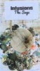
I then spent a happy hour playing with two PaperArtsy infusions - Magenta and The sage and here are the beetroot coloured fingers to prove it (or should I say radish coloured?). I was using the technique I showed you back in January and because I was working with a text stencil rather than a patterned one I started on the reverse side first. Pop over to the January post to see what I mean.


These are the results of the infusion playtime and you can see there were quite significant differences depending how much powder I used, how much water and whether I dried them with a heat gun or rolled paper towel over them to soak off the excess.


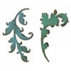
As I started to put the card together I decided I needed some greenery in it and the gorgeous new scroll die from Tim Holtz had dropped through my letterbox that morning. I thought it would be ideal as to me the two scroll designs look like vintage leaf stems and needing a quick background for them I simply rubbed four green distress inks over it but bear in mind my pads are getting rather old and dry so there wasn't too much ink to soak into the card and it needed quite a bit of rubbing and blending to get it covered. (See colours in the product list below).


But it worked, after I had cut them I blended forest moss around the edges.


I knew I needed some appropriate words so I delved into my boxes of stamps and found a set from the lovely Lin Brown with this phrase on. It is perfect stamped in aged mahogany.


Whilst I was placing elements I kept thinking that this really wasn't working - and then brainwave, I picked up the blending tool that I had just used with the forest moss and rubbed it gently over all the white spaces and around the edges and eh voila it transformed the background immediately and made it look more vintage. Now I was much happier with it and the colors complement the image really well.


At last I had adhered everything on - you can see the dimension created by foam pads with the additional radishes .....


... and the word vegetables from the stencil showed through just in the right place to form part of the design


Thanks for stopping by. I hope you like this vintage card.

hugs Brenda xxx


Tuesday, 28 March 2017

Tim Holtz inspired background card #2

Welcome and I hope you have been having fun playing with Tim's new Distress Oxides. This is the second card I made after the playtime I had with them a few weeks ago which you can see here and here and if you missed the first, more feminine card, you will find it here.


This is what the background looked like and I love the rusty patina colours in it.


I gathered the collage elements together with a similar colour palette using Tim Holtz ephemera packs and papers.


And I made my own little cabinet card type frame using a round die and using tarnished brass distress paint on the edge of an old credit type card and stamped the stars with the broken china oxide ink.


The guy is from Tim's photo booth set.


I layered up the collage elements ......


.... keeping it all flat so that the card can go in the post easily.


I think that little bird adds extra interest and would hopefully be great for a dad who has interest in birds in the wild.


 The greeting is one I made myself - I tend to print out an A4 sheet of various ones so I can pick and use one fairly quickly. I just don't own many words stamps and sometimes they're just not the right size.


Thanks for stopping bby this month, I hope you have enjoyed seeing how I used the Distress Oxides.

hugs Brenda xxx

Bumblebees and Butterflies