Wednesday 30 September 2015

Cards from inky backgrounds

Hi everyone, Nikki here, with some cards I made from some inky fun on watercolour card. I started by taking different colours on a large acrylic block and then spritzing them with water before swooshing my card through the colour. Once dry additional layers were added if required. These then became the basis for three bright cards!
I began designing my layouts. I added texture paste through the Scribbles layering stencil, die cut some words and used the mixed media thinlits to create layers.
 Here are the final versions...

Thanks for visiting today - see you soon.
Nikki

Monday 28 September 2015

Fall from Summer

The foliage in the garden has been losing its freshness through the month of August, and here and there a yellow leaf shows itself like the first gray hair amidst the locks of a beauty who has seen one season too many.... . September is dressing herself in showy dahlias and splendid marigolds and starry zinnias. October, the extravagant sister, has ordered an immense amount of the most gorgeous forest tapestry for her grand reception. 
Oliver Wendell Holmes


I had a leftover tag with picket fence distress paint resist and what looks like picked raspberry, dried marigold and scattered straw distress inks or stains. It has a lovely summery feel to it and decided I wanted to create the feel of summer turning to autumn when the colours begin to change and the gardens and countryside are a wonderful blend of the pinks through to reds and orange and into autumnal gold and browns.


I started off by stamping the bees from Tim's classics #12 set and wanted to add embellishments that have the autumnal feel to them.


I stamped and die-cut the leaf from the leaf  blueprint framelits creating texture and depth by running it through the cracked embossing folder, spraying with twisted citron, spiced marmalade and fossilized amber spray stains and covering with rock candy crackle paint. At this stage I sprinkled in some mustard seed distress glitter and let it dry. Once the cracks had appeared I dabbed on festive berries and mustard seed distress stain and sprayed as well with vintage photo.


To me fall isn't just about the gorgeous tones of reds, oranges and browns it is also about the end of harvest and the rustic sacks and bags that these goodies appear in. But how to show the idea that the beautiful leaves on the trees would be turning colour and by the depth of winter the undergrowth will be full of the decay and decomposing matter? I decided to add a border and found a Tim leaf border embossing folder which I used on some more leftover inked card.


Taking a candle and waxing over the leaves to act as a resist I then just layered distress stains, spritzing with water and heat drying till I had a more autumnal looking background and then ran distress ink pads directly over the raised areas, heat drying in-between each colour and misting with water at times until I had something that looked more rotted and decomposed.


Then I set about adding smaller embellishments and putting the whole thing together. For the little 21 button I added a drop of sunset orange alcohol ink and when dry I painted with scattered straw distress paint .


The little flower is a gem brad with mustard seed painted on the edges and top with a hessian disc punched for the petals.


The little heart was painted with scattered straw distress paint and dipped into butterscotch alcohol ink. As I love all the wonderful vintage portraits Tim uses I couldn't resist adding one here.


 I finished off with one simple sentiment taken from the nature remnant rubs sheet.


 Although I enjoy the summer, the sun and the warmer weather, I truly love and respect each of the seasons we have here in the UK. I believe we are blessed with a simple and never ending rhythm to our lives and environment which provides us with the opportunities to embrace change and direct our energies into activities that provide our rich tapestry of life.


Thanks for stopping by today.

hugs Brenda xxx


Tuesday 22 September 2015

Fly Away Mail Art

Hello Everyone! Jennie here again with my second post of the month and I hope you will forgive me doing a little repeat of my post earlier this month, but I really have got rather hooked on making these little single layer mail art pages!


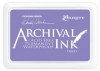
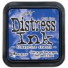
I absolutely love this new Tim Holtz Distress Ink - Blueprint Sketch. It is such a fabulous shade and has an amazing vintage feel about it (perhaps because I can remember the old Blueprint Drawings and Printer where I worked in the early 1970s!)


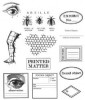
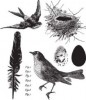
I started this page off again with the foreground element, stamping the bird in Blueprint Sketch and then making a mask from a post-it-note.


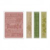
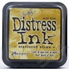
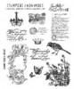
Once the mask was in place I could then stamp the underlying elements which I did using Vintage Photo Distress Ink and and stamps from the Correspondence and Shabby French Set. Layering the "stamp" stamp over the vintage photo created a darker hue and I can't wait to combine these two colours ……… 


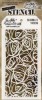
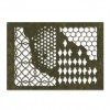
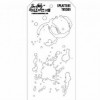
I then added some further layers using the Splatters Layering Stencil and Vintage Photo and blended more Vintage Photo around the edges of the page. I felt the page needed something in black and so stamped the postage frank mark in Arcival Jet Black.


Finally I added some splatters using my paintbrush and the two inks used for the stamping. Again, although this is destined for my Big Ticket Book I really think this would make a great topper for a masculine card.

Thank you for joining me today and I promise I will be back with something different next month!

Jennie x