Showing posts with label Infusions. Show all posts

Monday, 8 April 2019

Good Times with Wildflowers - Brenda

I have soooo fallen in love the new wildflowers from Tim Holtz I decided to make another card with them. This one is rather bold and striking, definitely not my usual colour palette.


Process steps
Spritz the back of the doily stencil and sprinkle over sunset beach infusions. Lay over the card panel and rub over with a dry piece of kitchen paper. Remove, heat dry and edge with age mahogany distress ink.


 Gather together some ephemera pieces to make a little collage .......


 ..... and adhere the flowers and sentiment over the top.


If I were to make another of these now it would take less than half an hour but the thinking time and die-cutting time (I cut 6 different colours of flower!!!) took me several hours to get it right. BUT .... I actually really like it now I've got it done. I hope you do to.

Have a lovely April.

hugs Brenda xxx

Bumblebees and Butterflies


Friday, 30 June 2017

Rainbow Sprinkle

I have been incredibly lucky to have had the opportunity to play with Elenazinski's new stamps from PaperArtsy. I loved this little chap and as soon as I saw him I knew that this is what I wanted to make with him.
I started with a tag and lightly misted it with water. I then laid the stencil on top and sprinkled with a rainbow of Infusions (A Bit Jaded, Lemoncello, Golden Sands, Orange County, Are You Cerise, Sunset Beach)
I then misted it again so the colours ran. I took the stencil off and misted it again! I then added Gathered Twigs Distress Ink to the edges and... misted it again! The colours are fabulous - why did I cover them up?!
I stamped and coloured the chap in rainbow colours and cut him out. I glued him to the tag and added a sentiment and some scribbled lines.
Thank you, as always for joining me - I hope you love this new stamp release as much as I do!

Monday, 12 June 2017

Scrapcosy radishes

Hi It's Brenda with you again today and I'm sharing a card made with those gorgeous images from Scrapcosy at PaperArtsy and her vegetable set. 


You may remember my cabbage one I made a little while ago and this is the radish design which I love. Here is the whole set.


I began by stamping the radishes on card using four different archival inks (colours below). I love doing this but I'm very careful where I place the ink pads and always work from the lightest to the darkest to help prevent contamination. I wanted the radishes to look a bit more earthy than they were so I painted in some aged mahogany and ground espresso distress inks and shabby shutters over the leaves.


But once I'd done that I thought it would look better if I added some extra radishes over the top to create dimension so I stamped them twice more and later repeated the aging process on them. 


I then spent a happy hour playing with two PaperArtsy infusions - Magenta and The sage and here are the beetroot coloured fingers to prove it (or should I say radish coloured?). I was using the technique I showed you back in January and because I was working with a text stencil rather than a patterned one I started on the reverse side first. Pop over to the January post to see what I mean.


These are the results of the infusion playtime and you can see there were quite significant differences depending how much powder I used, how much water and whether I dried them with a heat gun or rolled paper towel over them to soak off the excess.


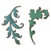
As I started to put the card together I decided I needed some greenery in it and the gorgeous new scroll die from Tim Holtz had dropped through my letterbox that morning. I thought it would be ideal as to me the two scroll designs look like vintage leaf stems and needing a quick background for them I simply rubbed four green distress inks over it but bear in mind my pads are getting rather old and dry so there wasn't too much ink to soak into the card and it needed quite a bit of rubbing and blending to get it covered. (See colours in the product list below).


But it worked, after I had cut them I blended forest moss around the edges.


I knew I needed some appropriate words so I delved into my boxes of stamps and found a set from the lovely Lin Brown with this phrase on. It is perfect stamped in aged mahogany.


Whilst I was placing elements I kept thinking that this really wasn't working - and then brainwave, I picked up the blending tool that I had just used with the forest moss and rubbed it gently over all the white spaces and around the edges and eh voila it transformed the background immediately and made it look more vintage. Now I was much happier with it and the colors complement the image really well.


At last I had adhered everything on - you can see the dimension created by foam pads with the additional radishes .....


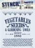
... and the word vegetables from the stencil showed through just in the right place to form part of the design


Thanks for stopping by. I hope you like this vintage card.

hugs Brenda xxx


Monday, 24 April 2017

More oxides and butterflies
Hi it's Brenda here with you today.

I so love playing with the oxide and butterflies together I have another design for you today.

 I found some pieces in my bits box that I was really happy with when I did them and I'm still happy with them now and rather than let them just sit there I decided to retrieve them and make a couple of cards. I thought these infusions and stencil backgrounds would make the perfect backdrop.


Whether it's because of Spring I don't know but I seem to have butterflies on my mind and I took one of Tim's stamps and his oxides and using peeled paint, broken china and walnut stain I stamped two mixed colour butterflies and before I knew it I had spritzed one with water - I just wanted to see what it would do .......

....... my brain was working overtime so I quickly heat dried the watery mess and re-stamped the butterfly again over the top and look what happened once I had cut them both out  ........  one beautiful crisp and multi coloured butterfly and one beautifully smudged looking one - I don't think I can choose between them so I'm pretty glad I had enough backgrounds to make two cards.


I continued on with some more edge inking and sentiment gathering until I was happy to assemble the cards together.


I kept it fairly simple even though I sat for ages trying to add other embellishments and stamps that I knew would clutter the design and spoil it.


Thanks for stopping by today.

hugs Brenda


Wednesday, 8 March 2017

Just Taller

Hello! It's my privilege to be featured on this blog today and I have the first of two projects featuring the latest Elenazinski stamps from PaperArtsy.
I started by putting Pewter paint on my page and then A Bit Jaded Infusions. I forgot to take a photo of this step but I do this pretty often so luckily there's a post here that shows this process!
Working quickly before the Infusions were full dry, I used a baby wipe to remove some of the colour through a stencil. The effect is very subtle so you could skip this stage!
The hanging plants would normally be the stamped on the bottom of the page so they grow upwards. Who likes normal?! I like to mix things up and to use stamps more creativity because that way they have lots of uses. To save having to cut out all the details I like to stamp onto my project. This is what my layout looked like. I used ZA04, ZA06 and ZA08.
As I stamp on the page I also stamp each image on card so I can colour this image in and cut it out.
I made this project on a very cold day earlier this year and I was so cold in my Studio that I bought the card into the house and coloured them in the warmth! Then just cut them out and adhere them to the page.
The left hand page looked this this when finished. I used the edge of an old gift card to add a little gold paint to the page as a finishing touch.
The right hand page looked like this:
Thank you, as aways, for joining in with me today - I hope you like my project!