Friday 30 June 2017

Rainbow Sprinkle

I have been incredibly lucky to have had the opportunity to play with Elenazinski's new stamps from PaperArtsy. I loved this little chap and as soon as I saw him I knew that this is what I wanted to make with him.
I started with a tag and lightly misted it with water. I then laid the stencil on top and sprinkled with a rainbow of Infusions (A Bit Jaded, Lemoncello, Golden Sands, Orange County, Are You Cerise, Sunset Beach)
I then misted it again so the colours ran. I took the stencil off and misted it again! I then added Gathered Twigs Distress Ink to the edges and... misted it again! The colours are fabulous - why did I cover them up?!
I stamped and coloured the chap in rainbow colours and cut him out. I glued him to the tag and added a sentiment and some scribbled lines.
Thank you, as always for joining me - I hope you love this new stamp release as much as I do!

Monday 26 June 2017

Oxides backgrounds and quick cards

Hi it's Brenda here today from Bumblebees and Butterflies with some more doxides (that's my shorthand for Distress Oxides lol) backgrounds which were actually left over pieces from other projects and helped made some very quick cards that I needed a while ago. You may remember the background masterboards I made as my first outing using the new Distress Oxides (here if you missed it) and then the two cards I made using some of it? (Again here and here if you missed those too).

Here's a reminder of the pieces I'd got when I had finished playing.


And here's what I made from the left over pieces. I stencilled and stamped to create some depth and interest ......


I inked the edges and added it to a 4 x 4 card .....


.... and then just added a butterfly - die-cut from left over pieces ......


..... and a stamped sentiment.


The same process with this one ......


.... choosing the left over bits carefully to tone in with the background colours ........


.... and using a different sentiment.


I have to say the feedback from my friends was so lovely I am now making little sets of these to sell.


Thanks for stopping by.

hugs Brenda xxx

I can't get into Inlinkz for the moment but here are the links to the Country View Crafts shop for the products I used.

Distress Oxides
Simple Sayings stamps set
Hashtags stamp set
Detailed Butterflies thinlits dies

Friday 16 June 2017

Can you resist this?!

I love creating resist backgrounds using paint. It can be more versatile than using wax or embossing powder because you can incorporate it more into the background. Let me show you.

Using a tag as my base I put white paint through a stencil.
Lightly mist the tag with water and spray ink over the top of the paint. Love those puddles of ink!
When dry it looks like this!
Add some Distress ink to the edges (I used brown and black)
Next I wanted a 'pop' of colour so I cut out a heart shape from kraft card and and added some red paint. I didn't want a uniform finish. A little more black distress ink at the edges finished it off.
Finally I built up the final images on the tag and added it to a journal page. I used a Paper Doll, and a Quote Chip as well as a little torn book page.
I hope you like my resist technique and try it some time!

Monday 12 June 2017

Scrapcosy radishes

Hi It's Brenda with you again today and I'm sharing a card made with those gorgeous images from Scrapcosy at PaperArtsy and her vegetable set. 


You may remember my cabbage one I made a little while ago and this is the radish design which I love. Here is the whole set.


I began by stamping the radishes on card using four different archival inks (colours below). I love doing this but I'm very careful where I place the ink pads and always work from the lightest to the darkest to help prevent contamination. I wanted the radishes to look a bit more earthy than they were so I painted in some aged mahogany and ground espresso distress inks and shabby shutters over the leaves.


But once I'd done that I thought it would look better if I added some extra radishes over the top to create dimension so I stamped them twice more and later repeated the aging process on them. 


I then spent a happy hour playing with two PaperArtsy infusions - Magenta and The sage and here are the beetroot coloured fingers to prove it (or should I say radish coloured?). I was using the technique I showed you back in January and because I was working with a text stencil rather than a patterned one I started on the reverse side first. Pop over to the January post to see what I mean.


These are the results of the infusion playtime and you can see there were quite significant differences depending how much powder I used, how much water and whether I dried them with a heat gun or rolled paper towel over them to soak off the excess.


As I started to put the card together I decided I needed some greenery in it and the gorgeous new scroll die from Tim Holtz had dropped through my letterbox that morning. I thought it would be ideal as to me the two scroll designs look like vintage leaf stems and needing a quick background for them I simply rubbed four green distress inks over it but bear in mind my pads are getting rather old and dry so there wasn't too much ink to soak into the card and it needed quite a bit of rubbing and blending to get it covered. (See colours in the product list below).


But it worked, after I had cut them I blended forest moss around the edges.


I knew I needed some appropriate words so I delved into my boxes of stamps and found a set from the lovely Lin Brown with this phrase on. It is perfect stamped in aged mahogany.


Whilst I was placing elements I kept thinking that this really wasn't working - and then brainwave, I picked up the blending tool that I had just used with the forest moss and rubbed it gently over all the white spaces and around the edges and eh voila it transformed the background immediately and made it look more vintage. Now I was much happier with it and the colors complement the image really well.


At last I had adhered everything on - you can see the dimension created by foam pads with the additional radishes .....


... and the word vegetables from the stencil showed through just in the right place to form part of the design


Thanks for stopping by. I hope you like this vintage card.

hugs Brenda xxx


Saturday 10 June 2017

Introducing Visible Image stamps

Hello it's Jane here and I am absolutely delighted to announce that Susan is now stocking Visible Image stamps.

 If you have not heard of these stamps you are missing a real treat. I am lucky enough to have found Visible Image stamps about 13 years ago when the company was in its infancy. Earlier this year I was thrilled to be asked to join their design team.

As an introduction today I thought today I would showcase some of the stamp sets that Country View Crafts has in stock by sharing some of my recent projects I have made with them.  Grab a cuppa while I share some photos of my makes. I will give the links to the CVC website as I go where you can purchase them.

Possibly their most popular current set, released in February, is Stay Curious


and the amazing Face it which also has its own mask


There are also  Create it  (lots of fab little accents,useful in mixed media too)


and Own it (great sentiments which works so well with the Face it (and any other stamps)
This was a shrink plastic bag charm I made.


They also have a 3 brand new sets which were launched to great acclaim on Friday.....Somewhere in Time,

Ahead of our time

and a fab alphabet called Alphabetical.

 These new sets are larger, A5 and there is so much to play with.These really fill a gap for those hard to make male themed projects. I'm sure it's not just me who struggles with them! This project uses stamps from the new Time sets;


Their stamps not only make fab cards but are brilliant for mixed media work and on canvas or 3D objects too. I had a 3D cat project in Craft Stamper which I will share on my own blog soon. Every set comes with an inspirational quote.
Below is a mixed media card I made with stamps from the Destination unknown set

together with script from the Scripted Streets set (not yet stocked). What fun are those paper planes!
The butterflies are from one my all time fave sets Own kind of beautiful

In the card above I also used an "Express yourself" quote (Love you longer). Susan will be hopefully be stocking these single quote stamps soon. 1 of my other fave Visible Image quotes is on this card... Life can be tough

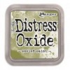
 The stamps also work brilliantly with backgrounds made using Tim Holtz'  new Distress Oxides. You can see  in the card above that I used some of the little accent stamps from the  Own it set
Finally if you like something more girlie you will love the Born to perform set
I used a sentiment for the  Own it  set with my ballet dancer..don't you love those ballet pumps too..these work perfectly on a card all by them self too.

This is just a small selection of the range of Visible Image stamps and a tiny selection of the work I have made ..more feature regularly on my blog here. I cannot recommend these stamps more highly. They are gorgeous quality; really thick, clear photopolymer and stamp perfectly every time. They are designed by Mark Alexander in Wales and made in the UK . Mark's designs are just that little bit different and unlike any others on the market.

I hope you have enjoyed seeing some of Visible Image's stamps. You can view the current range that is in stock at CVC  here ..I will share more projects with them here soon. Remember that Country View Crafts offers free UK postage so you really are getting a fab deal her by buying them here. You can also stock up with all your favourite inks and craft supplies too!

  If there are any other from the Visible Image stamps range which you would like to see Susan stock, or me to showcase with a project, please feel free to leave a comment on this post. She plans to order some new collections soon.

Thanks for staying til the end of this rather long post 😊 I think you might be able to tell that I rather love these stamps, they constantly inspire my crafting. 

Bye for now,