Wednesday, 22 January 2014

Crackle Art


Hello Everyone and lovely to see you here at Country View Crafts Updates.  For the last couple of weeks I have been experimenting and playing with Paper Artsy Fresco Finish Paints - beautifully chalky paints which blend oh so wonderfully!  So today I am sharing a tag I made using one of my experimental pieces.


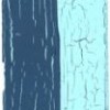
This was my base tag - I blended Pansy and Orchid Opaque Frescos on the base of the tag and then when it was dry I gave it a light layer of Fresco Crackle Glaze.  Apparently less is more in order to get the wonderful crackles.  It dried very quickly and then I applied the final layer (quite thickly) using Vintage Lace.  It doesn't take long for the cracks to start appearing - in fact it really is quite exciting!  

Leandra of Paper Artsy has a wonderful video HERE of the process.


Then it was down to decorating.  I thought that a selection of natural colours would work well with the lilac and linen colour.  My flowers were made from the Tim Holtz Tattered Florals Die and Vintage Photo Distress Ink.  There is a tutorial on my blog for the rose - just scroll down the side bar.


I even coloured my seam binding ribbon with the paints - it gives the ribbon a lovely chalkly finish.


And I just had to cut a leaf from the new Tim Holtz Decorative Strip Spring Greenery.  I think this is going to be well used!


And that was it really.  I just love the way the colours peep through the crackle and can't stop making more!


Thanks for joining me today and you will find most of the supplies I used detailed below.


Monday, 20 January 2014

A reminder it's 2014!

A slightly belated Happy New Year to you and yours! I had a lovely Christmas and New Year - we spent lots of time, just the four of us, playing board games as well as seeing family but there is something that is inevitable - that at the end of the festivities, when normality begins again, I can never remember to write the new year in dates! So this year I made a reminder from Art Parts!
To make the numbers I used a texture fade on sheet of metal card (or you could use mirror card) and then coloured it with Alcohol Inks. I then stamped the numbers onto the card and cut it out. A really simple way to make the numbers look really effective - looks great on a child's birthday card too!
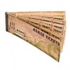
Whilst I had some Alcohol Ink left on my dabber I painted the Art Part frame with white paint and then dabbed the left over ink over the top - looks ever so effective! How are you remembering to write the correct date?


Friday, 17 January 2014

Altered shadow box

My project today is an altered shadow box frame and more of those scrummy Tim Holtz goodies – I am so looking forward to when Susan gets the new CHA releases into the shop – but I feel a huge spending spree coming on lol.


I started by cutting a piece of corrugated board to the size of the frame aperture, pulled some of the first layer off of it then coated it with some ordinary white household emulsion paint.


Next I tore up some dictionary and music papers and stuck a few bits on with matte medium.


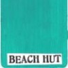
When it was dry I started to add some Fresco Finish paints (Snowflake, Rose, Guacamole, Beach Hut) and with brushes, a wet wipe and lots of water I dabbed and dripped the paints and sprayed them with water to merge them.


I started to plan the design on the board and gathered bits and pieces together that might work.


The tag was from my mop-up file which had some dipped distress paints on it, so I reached for one of my favourite text stamps from the Papillon set and stamped across the whole of the tag using picket fence distress paint. Of course you must clean your stamp straight away before the paint dries.


Then I blended distress inks over it to fill in the gaps.


The flowers were made with crinoline died with distress inks and put through the tattered florals and tattered floral garland dies.


Don’t they give you the most amazing shapes and dimension? I edged them with a little walnut stain ink to give them a more vintage look.


You can see I added a ticket and stamped pen nib.


The clock face was cut from a Tim Holtz paper stash and added to the weathered clock die-cut.


The beautiful vintage lady is a free download.


The centres of the flowers are gem brads but they looked too shiny so a dabbed some antique linen distress paint on them.


When putting the collage together I chose a number of additional small pieces to fit with the original bits, including some that I keep that weren't used on other projects.

I haven’t altered the frame yet but I intend to give it a coat of paint with crackles and some ‘worn’ edges.

Have a wonderful weekend and happy crafting.

hugs {brenda} x0x