Showing posts with label ATCs. Show all posts

Friday, 10 February 2017

Bronte ATC Inspiration

Hello its Jane here today with a debut post for the Country View Crafts project blog. Yes Susan has let me loose with a post for the shop. I apologise in advance that I am not familiar with the Inlinkz tool so I have written a list of the products I used today, with a link to Country View Crafts, at the end of this post.

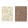
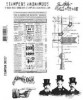
 I am sharing my newest PaperArtsy stamps which popped through my letter box this week. There are so many beauties in the new release but I went for the gorgeous Lynne Perrella LPC036 set. They are a nod to the Bronte sisters and I love them.

This set shrieks Jane Eyre to me so I wanted to do something book inspired.
coughs ahem....have never made any ATCs (Artist Trading Cards in case this is new to you) before. They have been around for years but I have never really thought about making them.  However last week I had fun mono printing with my Gelli Plate (an item from my stash that had been sitting unused in it's packaging for nearly 2 years!!)
 I only have a small one but I found that my prints were a perfect size to cut down and use for ATCs. I am sharing 2 of them here today. To be ATC size they need to measure 2 1/2" by 3 1/2" and I chose to round my edges.
ATC 1

ATC2
I won't go into the details of the actual mono printing as I recently shared these on my own  blog but these are Fresco colours I used.
 I also used a book page to create the background of ATC 1..it fitted my Bronte theme perfectly. No it wasn't a copy of Jane Eyre but A tale of two Cities but shhh...I won't tell it you won't 😉
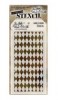
I also found that the Tim Holtz mini stencils fitted my plate perfectly.

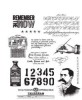
I used a couple of the spare prints for die cutting the elements I added. It means that the colours coordinate perfectly. I also used some Tim Holtz's Remnant rubs and Small Talk Ideaology stickers which again are a perfect size for ATCs.

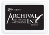
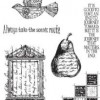
I stamped everything with Archival inks. For my ATC2 I used the little house scene stamp from Lynne's set. For the extra stamping I used one of my older PaperArtsy sets Lin Brown Eclectica ELB23 which has some great pattern and leaves.
Here are some of the details in close up
ATC 1


I used a white gel pen for accents and to add to the pattern at the side.The Remnant Rub pen below was just right for the Bronte book theme and you can still see the book page peeping through.


I die cut some flowers with the scraps and added liquid pearls to their centres.
I also added an eye Remnant rub through the window die cut of ATC 2


This little bird is peeping in at the old English scene...could that be Jane Eyre peeping out and singing..."Heathcliff it's me Cathy"...oops sorry that's another story isn't it 😉

Thanks so much for reading my post today. I really hope that I may have inspired you to either try or revisit making some ATCs. They are such fun. Try some different colours too. There are some amazing new products to play with in the shop....and with free postage too. 

As my little ATCs say...

If you're lucky enough to be different,
never change...
it's all perspective.....

Bye for now,

Jane x

My blog is Jane's Journal do pop on over...a very warm welcome awaits you there.


Main products used;

PaperArtsy stamps Lynne Perella and Lin Brown

PaperArtsy Fresco Paints bubble gum , candy floss ,  guacamole and toad hall

Archival inks leaf green ,  watering can and  Black

Tim Holtz Remnant Rubs elements

Tim Holtz heart mini stencils

Ranger liquid pearls

Tim Holtz Idea-ology small talk stickers

If anything is out of stock do email Susan as she regularly re orders.

Saturday, 20 February 2016

White Fire Wanderings

Hello all, Alison here from Words and Pictures, and I've been playing with the oh-so-fabulous new White Fire Fresco Finish paint from PaperArtsy.


I've loved the White Fire colour of Treasure Gold right from the start of my crafting, and it remains my go-to gilding wax... and now I can have it in paint form - fully metallic with a fabulous sheen.


It's also one of the translucent Frescos so you can use it over colour to add a fabulous sheen, or add several coats for more coverage.


I used two ATC sized pieces of card and ran them through the BigShot with the Tim Holtz Compass embossing folder, and then gave them a rough coat of the White Fire paint.  You can still see the card coming through in places, but even so the shimmer is fabulous.


I spritzed with some of the blue and green Distress Sprays, as well as adding some Ground Espresso.  I let the ink pool and in places spritzed it with water to get it to move more.


I added some more burnishing with Sepia and Jet Black Archival inks, just sweeping them over the raised texture in places.


The words were cut in plain white card using the Adventure Words Thinlits.  Once cut, I gave them a coat of the White Gold and then burnished with the Archival inks again.


They're layered over some torn book pages, and I added some vintage pen nibs to record the journey!


I added a bit of text stamping for extra detail and interest.


That's about it - a simple make, just a way to experiment with the White Gold Fresco paint really... and I can highly recommend it!


There's another project coming your way here in the next few weeks using the same paint, and if I weren't away from my craft table I'd probably still be playing with it now!


Thanks so much for stopping by today, and I'll see you again soon.

Alison x

Click on the links to go shopping at Country View Crafts:


Thursday, 12 March 2015

Noble Gentlemen


Hello Everyone and welcome! Today I am sharing a small and very quick project using some of my favourite supplies.  I love ATCs - little works of art - which are just perfect for trying out some new techniques. They are great to swap with friends and can even be utilised on Birthday Cards or as Gift Tags.


This was the background to my ATCs. I cut some light weight white board with the ATC die cut and blended Faded Jeans, Evergreen Bough and Dusty Concord Distress Inks here and there. Then I stamped the lovely corner blocks die from the Classics #15 set using Faded Jeans. I then used the Harlequin Layering Stencil to add some Crackle Texture. I like this Crackle Texture but the Ranger Texture Paste is just as wonderful. Then I left everything to dry.


My lovely Gents were stamped on Tissue Paper with Black Arcival Ink. It is not possible to stamp directly over the Texture Paste but by stamping on the tissue you can blend this in and around all the bumps and lumps of the texture you have created.


Once stamped you need to tear very carefully around the shape. Now I find this quite difficult so I use a wet paintbrush to paint around the images which makes the tearing so much simple. A great tip I picked up on Pinterest!

I used Multi Media to adhere the tissue to the inked board, smoothing everything out with a clean paintbrush from the middle to the outside.


I love the way that you can "adjust" where the pieces go. I always think these two are too far apart so I tore the tissue between them and squiggled the chappie on the right in a bit!  Once everything was dry I finished the ATCs with some Remnant Rubs, being very careful with the rubbing over the stamped tissue.


The eagle eyed of you will know that this Gent is normally looking the other way. As the Arcival Ink stamps right through the tissue (and do please do this on a craft mat or piece of paper) I was able to use the reverse and so he looks a little different looking right and not left!

Thank you for joining me today and I hope you also have some fun creating ATCs with some new products and techniques.

Jennie x


Wednesday, 12 February 2014

How do I love thee...let me count the ways .

Well it is time for me to post another make and this time I have gone for a little ATC book, made from scratch using Tim dies and tissue tape...along with lots more distress goodness. I have filled my little book full of hearts each using a different technique but this could be filled in all sorts of ways. So here my make and how I created it.


and open...


So I started by cutting 12 ATC die cuts from ivory cardstock and tow from grey board ( for the cover ). I glued a piece of card onto each side of the two grey board covers and also glued all the ATC die cuts in pairs to give a double thickness. (Hope that make sense?) . I then added colour using distress paints on my craft sheet, lots of smooshing and drying later they had a base of colour.

Then I attached each page together using Tim Holtz tissue tape together  on each side...make sure you leave a tiny gap between the pieces so that they can fold shut ..


Now for the background stamping on the pages... I used soft colours and a variety of stamps for this stage ...staring with lighter coloured distress inks  ( here using Halloween script stamp, I also used pumice stone for some numbers ...


And completed the book by stamping the flourish in black soot distress ink.When dry I edged the pages in aged mahogany.

Now for the hearts ...I went a bit mad and decided to create each of my hearts using a different Tim technique/product but really you could add whatever you like and then selected chit chat stickers that said what I wanted... so here is a whistle stop tour of the hearts ...

here I used a mosaic technique and picket fence resist.
(edging hearts in black soot distress ink really gives them a lift)


shattered stains and  an embossed heart 


embossed metal technique and shabby chic technique from Creative Chemistry 102


Wendy vecchi paste through stencil and some distress glitter coloured up with stains


Stamping and inking and then Wendy Vecchi paste layered thick and coloured when dry with Distress


An old book page and rock candy glitter coloured with distress stain


and altogether...


all tied together with seam binding dyed with distress stain :


well hope you like my jam packed little make ...maybe you will be inspired to make one for a special occasions...if you do let me know I would love to see!

keep those fingers inky 
Trace x