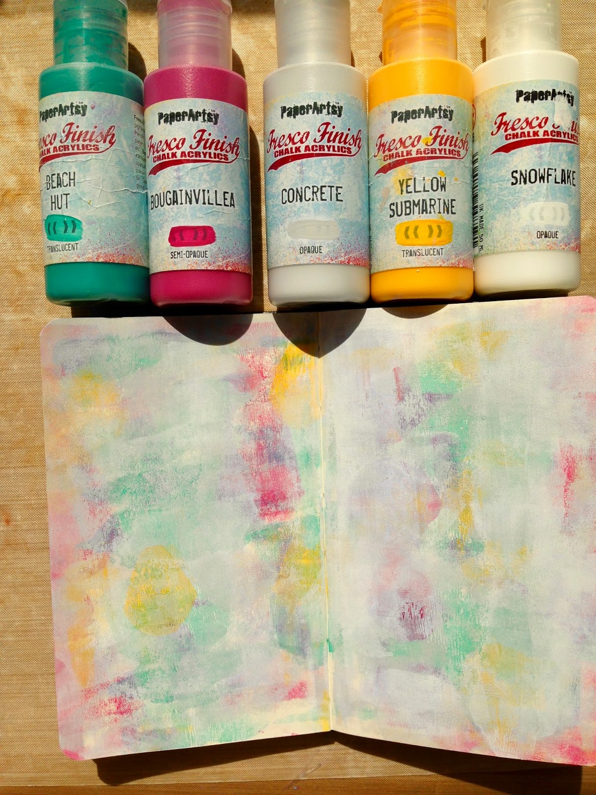
I have a new small Moleskin journal - I like to use a variety of sizes as the mood takes me so I might have 5 journals all in various states of completion at any one time! I work from the outside pages in so that the journal lays flat as you use it. I used the first pages at the front of the journal first so the next pages to use were what will be the last pages. Hence the theme being "the end".
I brayered Beach Hut paint on the page using a blob of paint about a centimetre wide (you really don't need much!) then I added Bougainvillea, Concrete and Yellow Submarine in that order, drying each layer before adding the next. I then added double the amount of Snowflake Paint so the colours beneath peek through.
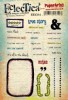
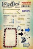
The border and stem and leaf were stamped on tissue paper and glued into place. The flowerhead was stamped in Bougainvillea (clean your stamp straight away!) and then in black ink. I added the centre which was stamped on card.
The journalling spot was stamped on tissue paper, cut it out and used Bougainvillea for the border (painted on the reverse). I then added the sentiment and throughly dried it before adhering it to the page. Then I used old lids and an expired credit card to make circles and lines. I then added the odd word stamp from various sets as final flourishes. Thank you for stopping by today, do let me know what you'd add to your final page of a journal!
Friday, 26 June 2015
Wednesday, 24 June 2015
Down at the Bottom of the Deep Blue Sea ……….
So this is how the tag came about!
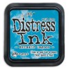
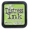
This was my experimental tag using the Mermaid Lagoon and Twisted Citron Distress Inks which I had splodged onto my craft mat, spritzed with water and then picked up on the tag. Delicious!!!
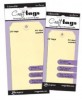
So then I did the same thing on a Ranger Manilla tag, but of couse a different substrate so the colours were a little different. I have added a little bit of tissue tape and some stamping using the Correspondence stamps (sorry you will probably get fed up of seeing these on my work, but they are so useful for background stamping). I added a little Black Soot Distress Ink around the edges of tag to blend everything together.
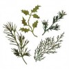
These two die cuts were sitting in my scraps box having been cut from the Ranger Manilla cardstock. I added Twisted Citron Distress Ink to them first and the Mermaid Lagoon on top and got this wonderful turquoise green. By the way the leaves are from the Christmas Holiday set - I think they are just perfect for using all the year round!
I mopped up what was left using my ribbon.
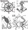
I stamped an anchor from the new Maritime Blueprint Set and coloured it again using a combination of Twisted Citron and Mermaid Lagoon and got a completely different colour again.
Then it was time to put it all together. The ribbon was gathered up and stuck down with clear glue and I added a little hessian and string before using these lovely shells I found in a shop here in Lerwick. A few seed beads, again stuck down using the clear glue gives a bit more of an underwater feel.
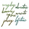
I hope I don't get to "discover" what is at the bottom of the deep blue sea as by the time you read this I shall hopefully be sailing on top of the sea!
Some of the new distress colours are very bright such as the Twisted Citron but they do work so well with other distress colours. More experiments are on the way! I hope this inspires you try mixing the colours to see what you get.
Thank you for joining me today.
Jennie x
Labels:
Blueprint Stamps,
Distress Ink,
Jennie,
Sissix Thinlits,
tags,
Tim Holtz
Monday, 22 June 2015
Don't forget .. to follow your dreams
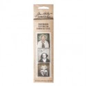
I made them using the brenda walton notelet die and they are so simple to put together and can really be embellished in whater style you like... but you know me I do love my photo booth and guess what , they are the perfect fit for these.. I wanted to try and coordinate the colours to fit how I saw the women in the photos...and also managed to make al of these quite colourful...well for me anyway x
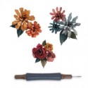
I have embellished each one with some quilled flowers using the tiny tattered floral die and some of the tiny leaves...
I added some dyed seam binding to compliment to colour and the photo booth picture and a chit chat word.
here is the inside...step x steps to follow ..
I started by die cutting the shape from card , I didn't use too tick card and it helps if you have a crease pad instead of one of the cutting pads ....as this applies just the correct pressure to cut where it needs to cut and crease where it needs to crease...if that makes sense!
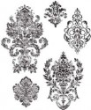
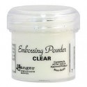
I inked up the distressed damask stamp with perfect medium and then stamped the design randomly over the surface, sprinkled on clear embossing powder and heated until the powder went clear and shiny.
(sorry about the photo)
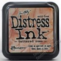
Then it was time to add some colour...for the pinky toned one I applied some tattered rose distress ink on the outside and also on the inside, as this will be seen when the notelet/notebook is opened.
It really makes the design pop out...
here you can see the whole piece coloured and folded, ready for some added stamped detail..
For the stamping I used a text stamped, inked in similar colour as background, as it still stands out a little bit and I didn't want it to be too prominent.
here is how it looks ..sorry forgot the picture for the pinky one, so this is the antique linen one ..
For this one I also used the new distress distress spritzer to give a splattered effect, spritz the cover with water, leave for a few seconds and then heat dry...
To complete I added a hint of colour to the photo booth piece , using distress marker and then heat dried..I also scuffed the edges and sanded the edges, adding a bit of walnut stain distress ink using blending tool..
I also added some of the tiny tattered floral thinlits ..but got so carried away I forgot to take a picture!
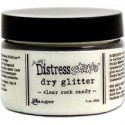
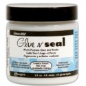
I brushed some colour over the tops, dried with heat tool, brushed with glue and seal and dusted with rock candy distress glitter. I then added these to the front with a chit chat sticker, edges swiped with distress ink too.
Finally, on the bottom opening part I tied around some dyed seam binding to form a bow.
Here is the one using antique linen, for some reason it makes me think of weddings?
And a light purple one , as it is my little Lucy's favourite colour..
keep those fingers inky!
see you soon
trace x
Labels:
Brenda Walton,
dies,
Distress Ink,
photo booth,
Tim Holtz,
Trace
Subscribe to:
Posts (Atom)