
Hi, Amanda here again, this time with masculine and feminine
versions of a design using images from the Popcorn bear range of
stamps. Both feature frames made from the same striped paper, and
layered backgrounds using alcohol inks and watercolours. I hope
you like them!

Between them, the Popcorn stamps include greetings for most
occasions, but I've made the feminine version up as an 'any
occasion' card - I like to have a stock of cards without
greetings, ready to personalise when I need them.
Note: The Popcorn bear stamps are sold unmounted and uncut,
so the first time you use them you need to cut out all the
stamps. Leave a gap of a couple of millimetres around each image
when you do this, or you'll find it hard to get a clean image.
You don't have to mount the stamps before use, but it's more
convenient if you do. I used U-mount - simply stick to the
stickiest side and cut round.

Once my stamps were mounted, I started each project by stamping
the main image in black archival ink and colouring with
watercolour pencils.

I blended the pencil using a wet paintbrush and cut out, then made
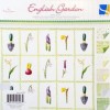
a frame on an aperture card using striped paper from the English
Garden stack, cutting the corners diagonally like this:

I use a pokey tool to mark where to cut when mitring corners like
this, as it's more accurate than a pencil, and can mark both of
the mating
edges at once.
Next, I made a three layer background for the image. The top
layer is acetate, onto which I 'painted' a grassy hill and blue
sky using alcohol inks/mixative. To get the shape of the hill I
cut a piece of scrap acetate into two pieces and used each half of
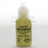
this as a mask. For the sky, I randomly dotted denim alcohol ink
and pearl mixative onto an applicator and added blending solution:

I applied this to the acetate by first dabbing, then streaking, in
2 or 3 layers to build up the colour.

For the hill colour, I randomly dotted two colours of green
alcohol ink onto the applicator, added blending solution and then
dabbed onto the acetate, again building up layers. Here's the
finished acetate layer:

I fixed the acetate to the aperture card using double sided tape,
then fixed a sheet of white vellum behind it. The vellum adds
depth to the overall image, by making the back layer look more
distant.
For the back layer I painted rough hills onto white card using
watercolour pencils - a light hill the same as that on the
acetate, and two dark ones visible above. The distant hills need
to be dark as they'll have part of the sky layer over them - the
result looks like cloud shadows and mistiness.

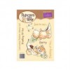
Finally, I stuck the aperture pocket closed, then stuck Popcorn
into place. I stamped a few extra flowers by part inking the
stamp, and cut out. To give the flowers some shape, I placed them
on a soft mouse mat and rubbed the centres with the rounded end of
a pen before sticking them into place. A little dimensional paint
in the flower centres finished the card off.

I made the masculine card in the same way, but omitted the vellum
layer, so show the difference. I also rearranged the elements of
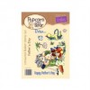
the main image in the stamp set. Here's what the original image
looked like when stamped and coloured:

I also added a little section of die cut fencing, distressed with
Vintage Photo distress ink, to give the idea that Popcorn is in
his garden.

Thanks for stopping by, happy crafting!
Two fab cards, the Popcorn Bear stamps are quite cute, beautiful colouring:-) x
ReplyDelete