
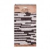
Hello all, it's Alison (butterfly) here from Words and Pictures, and I've been using one of my old books as a journal again.... just playing around really.

This started out going in one direction, and then shifted, and I'm a bit surprised about where it ended up, but I suppose these colours are something of a foretaste of spring.

Initially, I was just gluing down some paper scraps left over from another project to get them out of the way... then I added a coat of gesso to soften and blend everything.

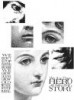
This Tim Holtz woman used to bob up in my early journalling efforts quite often, but she hasn't been out for a while. I stamped her in Pumice Stone and clear-embossed over the top to give her a subtle presence on the page.

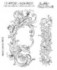
Over at the other side, I did the same with the fabulous large flourish stamp (also a TH one).

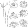
I'd been playing around with the wonderful cone flower for something else where it didn't quite work, so I tried it out on these pages and rather liked it.

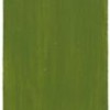
Then I started to build up layers of colour, using mainly Fresco Chalk Finish Acrylic paints, first in blues (Smurf, China and Blue Glass)...

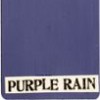
... then some (slightly surprising to me) shades of mauve and lilac (Wisteria and Purple Rain, and eventually some Blueberry). There's some Wilted Violet Distress Ink in at this stage too...

... a layer of Ground Espresso stencilling (which barely made it through to the end)...

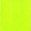
... and finally a step into brights with Hey Pesto and Limelight. From a distance I confess it does look slightly like the final stages of a very impressive bruise!!

But close up I love the effect of the layered colours.

Shading around the main images helps them pop.

I used the same colours to light up the woman's eyes, and I love how she emerges out of the purply shadows.

There's lots of splatter - mainly in Ground Espresso, I think.

The inking around the edges gives us a really nice look of aged weathering.

And I really like the effect of the embossing resist of the flourish under the paints too.

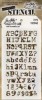
I used some Small Talk stickers and, as I did with my recent tag for the Make Your Own Background theme over at Country View Challenges, I used a white pen to doodle lines around them.

I love how this completely changes their look.

So there you have it... another journalling journey. I'm not always sure about the results, but I do enjoy the process and the learning, and I think that's what journalling is really about.

Thanks so much for stopping by today, and we hope to see you again soon.
Alison x
Click on the links to go shopping at Country View Crafts!


Beautiful subtle colours giving an ethereal feel xxx
ReplyDeleteI think it is stunning - I love the colours, especially that pop of Limelight.. gorgeous, gorgeous spread.
ReplyDeleteA wonderful spread dear Alison! Amazing!
ReplyDeleteLimelight was a bit of a surprise Alison,mouth looks great with the Wilted Violet! Love the images and the sentiment! Great inspiration, thanks! X
ReplyDeleteDon't know where mouth came from....should say that limelight was a bit of a surprise!
ReplyDeleteWonderful step by step Alison and such an amazing array of techniques/details. Love the colours.....though you did make me smile about the remnants of a bruise !!!!
ReplyDeleteVery inspiring
Hugs Annie x
Stunning!!! with wonderful photos and information - thank you.. Gill x
ReplyDeleteFantastic layout Alison, love the stamps and colours! xx
ReplyDeleteA truly fabulous spread! I had been trying to resist those flowers-but you have convinced me that I need them...now! I love the subtle splattering over those gorgeous colours! Hugs, Chrisx
ReplyDeleteLovely!
ReplyDeleteOh Alison, this is a stunning spread! I love the springy colors and the softness and the ominous gaze of this pretty lady! Truly lovely in every way!!!
ReplyDeleteA real spring spread, the lovely tones are making me wish for the field, opposite my window, to turn green, and I love the result with the use of mauve Alison. Wonderful texture with the embosed swirls, and the many papers you firstly adhered, and yes the white lines around your word stickers give a great look. And love the splattering :-)
ReplyDeleteDorthe xxoo
Lovely, Alison - certainly a welcome vision of Spring! Beautiful journal pages - one can read so much into them! xxx Lynn
ReplyDeleteStunning layout Alison and I love those spring colours. Mo x
ReplyDeletebeautifully designed and executed pages Alison - you make it look so easy - the face is almost ghostly there in the corner - love the colors! Julia xx
ReplyDeletethis is exquisite - I love it Alison - beautiful work x
ReplyDeleteBeautiful colours Alison and I just love the gorgeous cone flower and the face looks wonderful... Anne x
ReplyDeleteBeautiful and I love that you've used my favourite Tim flower too ;)
ReplyDeleteHugs
Donna xxx
Loving this blend of colours and the ethereal quality the young lady has. Great experimentation. Jenny x
ReplyDeleteFabulous, love how the cone flower turned out and yes the green in the lady's eyes, really brought her to life! I love the white lines around the words, one to remember, it really makes them pop! Great spread!
ReplyDeleteWell first of all I think old books are definitely the best to use. They have a texture and a smell and feel of the pages that it is really hard to duplicate. When I first started seeing art journaling I was really not impressed - not for me at least. My eyes did not know where to go and all my mind thought was humble jumble. Believe me Alison - I don't need anymore humble jumble than I have naturally. Then your style burst upon the scene and you were more me than me! Now if only I could find the original me!! Love everything you do Sugar!!
ReplyDeleteSandy xx
I just started a new art journal in an old book as well and I have really loved the look of the text peeking behind the art. Lovely page, the cone flower is quite pretty.
ReplyDeleteIts brilliantly made and very colourful and vibrant too.
ReplyDeleteA very nice "learning page" bruised or not!
ReplyDeleteSally
I love your play! Beautiful layers and colors! As always, I am a fan,Alison! xo
ReplyDeleteI love using old books for journals and old book pages for creating interest in a background. This journal spread is just lovely, Alison, with just the right colors for interest. Well done!
ReplyDeleteSuch a beautiful page.
ReplyDeleteBruise or no bruise those colours are gorgeous together. Love your pages xxx
ReplyDeleteGreat pages, love the colors palette and as always you sign your peoject with your unique style! Barbara
ReplyDeleteLovely Alison, love the colours you used and that beautiful image of the lady. The single flower was the perfect counterpoint. Thanks so much for sharing this lovely journal page! Deb xo
ReplyDeleteAdore this new page Alison!!! Coco xx
ReplyDeleteLove, love. love these pages, Alison! The torn paper adds such an interesting layer and the colors and image all equal gorgeousness!
ReplyDeleteI love the subtlety and texture of this spread. The collaged paper and the colours are great, I think. It is so nice to see Tim's lady again! She is so adaptable, fitting into all sorts of environments and always looking subtly different.xx
ReplyDeleteOf course those colors make me happy and I can't see how you could go wrong with them. I like how they highlight your images. I really like the distressing and weathering along the edges of the pages and how it interacts with that embossed resist. Nice!
ReplyDeleteAh, another lovely journal page with those colors and splatter I adore! Sure love your stamped images, as well, and I have flourish envy! No, not a bruise at all, but a fresh spring day after a short shower with clouds still in the sky, just before the sun pokes out and makes everything hot and steamy. Love the sense of peacefulness! Hugs!
ReplyDelete