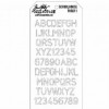
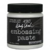
I wanted to emulate the beautiful clean projects that others do and so thought I'd start by creating an interesting background. I used Embossing Paste through a Tim Holtz stencil. I used Embossing paste because it's white but Grunge Paste will work too!
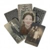
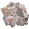
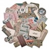
I then a stamped the ruler stamp from Artful Tools onto some white card and added a picture and some ephemera and glued them all together. At this point I was pretty impressed by how clean and tidy it looked and really how well I managed not to add any Vintage Photo Distress Ink! But then...
... I thought I'd see if I could translate it onto a tag as I do love a tag! But the colours weren't as clean as on the journal page as the tag is manilla so I added Chalk and then Cherry Pie paint to the tag and created a lovely pink! I wiped off excess paint with a baby wipe which gives it an aged look. It looks really bright in the picture - I think my photo editing might have been a little zealous!
I sanded the edges a little and did buckle and add Vintage Photo Distress Ink to the edges! I took the assemblage I'd made for the journal page and added to the tag. I loved the pink behind the sepia colours of the ephemera.
But then I had a idea - what if I combined the two?!
The tag was too long for my page so I chopped the bottom off and now I feel really happy - funny how it took making two separate projects to make one! I hope I still managed to keep the page relatively clean and simple - Let me know which version you prefer!





Smiling at the story behind the project, but love how it all came together!
ReplyDeleteI love the pop of colour Gabrielle, it really transforms the layout. Xx
ReplyDelete